Wednesday, 27 January 2021

MUSIC VIDEO TRADITIONAL FRAMES

MUSIC VIDEO TRADITIONAL FRAMES

In my studio setup at home, I have been drawing frames for my predominantly traditionally animated music video. The practice is relatively time consuming and encounters a few issues but the end result is satisfying.

The frames which represent characters were drawn using real videos as reference which are referred to constantly. the images above represent a loop of deep breathing for the opening of the video. to work with my shifting backgrounds I have drawn camouflage patterns on the t shirt using g colours which represent t fungus. The process of making each frame a layer in photoshop takes time but has taught me about keeping my drawings organised by grouping these layers in photoshop. this means that when in ~After Effects they are much easier to animate.
To create a psychedelic look for the film, many of the backgrounds will shift in colour and texture.


The frames below were drawn b y pencil and Japanese watercolour initially with a loose style. This meant that I could quickly sketch the movement before inking in and making them more fluid in animation, an issue I encountered when scanning the pictures was that the fluorescent colours wouldn't come out as colourful as I would have hoped. I tackled this issue by photographing each frame on top of the Lightbox on my peg bar, which made the colours much more desirable for my final animation.


Sustainable fashion project

Meeting notes

Dancer represents the themes of sustainability and upcycled clothing


Around her could be imagery of industrial scale materials being used and draining the planet of natural resources. 


Moving images of Milenas textile mood board images could shift - dynamic natural colour to contrast with pollution. Could use grey to contrast. 


James’ images of money could work well to contrast with our themes of Boro clothing ie. contrasting colours and crosshatching. 


Hanging sheets up could differentiate different themes and would be good to projection map onto. 


Notes on video


The epilogue for the song has a melancholy tone. Would be effective to show imagery of money and worlds resources being drained.


Boro style dancer


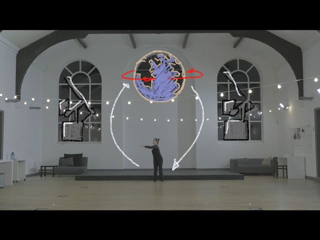
SC 1 - Fast arm movements could spin a globe above Marina’s head

(Possibly grey background around to contrast)


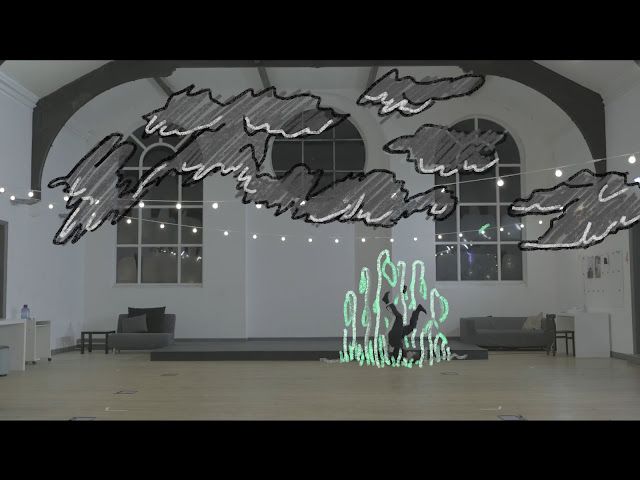
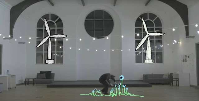
SC 2 - Marina is close to the ground. Could show her attempting to raise nature and cultivate plants but failing to do so in midst of pollution around her


SC 3 - Movement at first shows her trying to get to her feet but looks like there is a weight on her. She then gets to her feet which could mark some form of success (something like a sunflower or hopeful imagery?)


SC 4 - More upward arm movement could show trees growing 


SC 5 - Music drops. Pulsing movement could show more greenery growing. Boro can start appearing over the dance floor in places where she moves


SC 6 - Earth could reappear with reinvigorated colours. Water droplets could fly around to resemble healing


SC 7 - Leg spins could spin some cog. Boro animals could appear among Boro trees


Ending we could have a short narration or type face to consolidate our message.


Custom Slipmat inspiration


Duchamp's display of oscillating disks are good inspiration for further slip mats with animated effect. Rather than using frames to create movement, Duchamp's pieces display circles with different centre points. This too serves as a form of optical illusion as the circles move on separate parallaxes as the main disk spins. This is a point of animation for the slip mats I could take forward into my designs. A similar effect would be using spirals.

The clip below is from The Last Airbender. It was recommended to me after I had been looking at the art of spinning animation. The imagery on it provides as good inspiration for a slip mat. The end of the clip shows two fish synchronised swimming in a circle. A simple but effective way of applying animation would be to replicate this and as the turntable spins the fish will too.

Scan the Horizon

 Scan the Horizon

Looking towards graduating from the BA, I have begun to consider short and long term plans to ensure that I enter into the right career to nurture my strengths and provide me with the right means for living.


My plan for the next year is a postgraduate course continuing on at Leeds Arts. Provided my application is successful, I will continue my learning journey which will undoubtedly come hand in hand with working on commissions, gaining exposure and potentially entering into competition briefs and festivals. A useful avenue the application for the MA has given me is that I have reopened lines of contact with two studios with whom I have done work experience. The first was Arran Stamper of BlinkInk. She has given me contact information for people at BlinkInk. Even though she now works at Mystery Q now, a film studio I have not heard about prior. They have seen an old copy of my showreel and are open to see more, knowing that I am nearing the end of my undergraduate course. BlinkInk is the kind of studio I can see myself working in because of the community of workers there and the variety of commissions and mediums they use to make their animated shorts.


I believe that the MA is going to open up my ideas about working freelance, at least for a few years after graduation. This is also a viable career path If I create the right networks this could suit me well before joining a studio job. I have already started considering collaborations and opportunities beyond the work I am currently doing. One of these is Artsthread. Like D&aD, they run competition briefs, one of which I have been approached to collaborate on.


Further to this I have been contacting a poet with ambitions of entering a film into a number of festivals. He has already won awards for his project cocoa bean, which tackles issues of the BAME community, and hopes to tackle the issue of sustainability in this upcoming project.


The aspirations for these projects which will hopefully take place in the coming 2 years will hopefully establish myself as an employable animator by creating more contacts and reaching more consumers.


It may take a while to get a foothold in the animation industry so I need to safeguard that I will be making an adequate salary. Support from family will carry me through the masters but I hope to gain a form of financial security over the coming years. I have been working on exposure which has been effective in getting me commissions. I have now set up an online store which has gained some popularity through assistance of instagram promotions. Social media has proved to be an effective tool to find work.


This enterprise will hopefully grow through assistance of my LinkedIn account and fore coming website which will give me more of a professional presence online.


Living in Leeds has suited me well in its cheap living costs and booming music/television industries. In the midst of the pandemic, a lot of the live work I would hope to do may be unavailable but there are still a myriad of creatives needing to distribute their work from home. I believe this could work to my advantage. If for example a musician wanted an eye catching video but is working form a studio at home, animators are more than able to provide this. Through the equipment I have at home currently and possibly more softwares, freelance work will be accessible at home and fortunately the animation industry is one that can potentially thrive in these troubled times.

Tuesday, 12 January 2021

SCOOP GRAPHICS

For SCOOP's emails and general promotion, a black and white version of the logo was required with more graphic traits. This was drawn on the Cintiq for smoother line work. The brand have a specific set of 3 colours as the basis of all their social media posts. This was not what I would have preferred as I enjoy using dynamic colour so I will try to negotiate different ways of using colour while conforming to their brand.

Animations will be carried out in the future: For example I will make the globe spin.


Animated slipmat


Creating an animated slip mat is not dissimilar to early forms of animation such as zoetropes. The difference being that with zoetropes, each frame is viewed individually through a pinhole or gap which allows you to see one at a time. Other methods I have seen used are strobe lights which flash in time with the animation


The technical term for the animated slip mat is stroboscopic disk, meaning that the viewer sees each frame of the animation simultaneously. In my first test, I used a 24 frame animation oriented at each 15 degrees of the circle to have them evenly spread around the slip mat.


When spun on video, the images represent the walk cycle effectively moving forward. However, in reality the naked eye would not be able to see the moving image but rather all the frames spinning. I have been reading about the spatial relationship between frames which can be manipulated in a way that is not required in screen based animation because the frames are played one at a time in the same linear fashion.


Thursday, 7 January 2021

CUSTOM SLIPMAT COMMISSIONS

My Passion for music has lead me to think about creating products to compliment the music industry, both through animation and merchandise. There has been a surge in the old fashioned ways of music distribution. Vinyl records and records should really be obsolete technology but people are drawn to the physicality, aesthetic and nostalgia of such pieces of kit. 

My idea is to personalise these with Illustrations on slip mats.


I have also been inspired by the detrimental effect the pandemic has had on the music and hospitality industry. In the current lockdown, artists have taken to live-streaming their music to continue distribution. Although these people have taken a heavy blow, the music never dies! People will continue to listen to music at home on their record players.

Furthermore, The Independent recently released an article predicting a second 'roaring 20's' which took place after the Spanish flu pandemic. This would imply a surge in people's urges to seek human interaction. The article uses imagery from the Great Gatsby, alluding me towards the impression that the music scene could be bigger than ever on the back end of this dark time. Creating content to accompany the music industry is therefore something I believe to be profitable presently and even more so in the future.

My initial six designs were a mixture of bespoke designs for particular artists. Below is the design for Leeds based DJ, Tortuga. I believe that by distributing these, a following could be made through social media. Musicians attract other musicians so the more attention they get, the more business will be in these designs.
To apply animation technique to these, I have been looking into zoetrope style covers which present the frames in a circular/spiral fashion. Applying animation frames to these would create effective animated slips.

Music Video mood photographs + more

 Music Video mood photographs + more

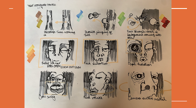
Using Cordyceps for inspiration, I set out creating a storyboard which fits to my client's aesthetic. This 2D animation will be carried out by hand on the Lightbox. This may present limitations as it is time consuming to sketch and colour each frame. This can be tackled through loops and other shortcuts in Adobe.

The project will also be coloured by hand as I like the texture of Promarkers. Colours are roughly mapped out next to the storyboard panels.


Photography will be layered behind the animation with psychedelic effect using opacity transitions.
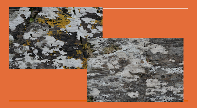
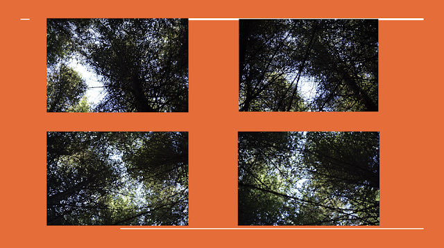
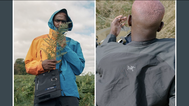
I have experimented with different textures in nature which I believe would compliment the foreground animation.


SCOOP GRAPHICS

 SCOOP GRAPHICS 

Scoop is a student run shop which started in Durham and is branching out to the University cities like Leeds. They recently ran a graphic design competition for a logo. Fortunately I won and will be creating weekly content for them with my typography, illustrations and short animated Gifs etc.


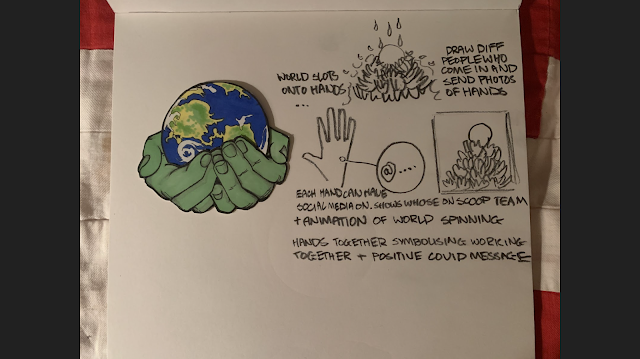
The hand drawn logo is one which will be represented on their social media and when the Leeds shop opens it will be framed in store. The brand encourages zero waste foods and general tips on sustainability. With this in mind, the logo has Hands gently cradling the globe. These paper cutouts are designed to slot together. Therefore the more people who subscribe to the Scoop community will provide their hands, creating a pyramid which supports the globe.

The brand has a specific colour palette so I will have to conform to this by changing the colours.


Initial typography designs


Final Logo Design


Sustainable Fashion Project

Sustainable Fashion Project

Examples of upcycled clothing which could be effective for our project.


Milena has supplied us with a dancer who will interpret a piece of music of our choosing. With her interactions with our animated content, we need to translate the message of sustainability.


In a concept video by James, he has incorporated electronic music dubbed with news reports about pollution and mass clothing production. It worked surprisingly well to evoke themes of industrial scale production.

The dancer can be seen in front from a concept video we received from one of our collaborators.


I sketched a few fashion ideas which could either be made or projected onto a plain outfit. I kept the themes within nature, representing the energy provided by elements like sun, water and photosynthesis. I thought that an industrial background could be a way to encourage the up cycling of clothes by using grey tones in contrast with the bright colours represented here.


The dance space is dynamic, with the potential for ambitious projection mapping. We remain optimistic about the possibility of using this large space during the pandemic so I took to sketching out some concepts for how we could use the space physically and through projection:


The two left representations further show the power of the elements. Top left shows water being pumped with immense power with a globe at its centre. The blue pallet would be symbolic of nature and natural resources being overused. It may be tricky to translate the sustainable message with just this imagery.

Bottom left shows the power of the sun amid a grey urban environment. I thought the beams could move around illuminating certain areas eventually resting on the dancer. 

Top right shows piles of physical clothes and fabrics which could represent waste on a global scale. The concepts of Boro could come into play by projecting similar textile like patterns onto the piles.

Finally, my favourite concept is hung up sheets. These could have different themes like the ones above projected onto them and would make the space more dynamic because the dancer could interact behind the sheets making silhouettes. I believe this would also be the best way to translate our message as many themes could be shown.

Wednesday, 6 January 2021

Review your presence


 Within my individual practice, I am beginning to discover the career paths I may take moving forward. The calibre of work I want to do is interlinked and spans onto select areas of the production pipeline.

I enjoy creating short, aesthetic 2D animations and illustrations. I credit myself with the ability to quickly generate ideas. This makes me useful for pre-production processes such as animatics, character design and storyboards, especially with my aptitude for quickly drawing by hand.

My latest showreel demonstrates projects I have worked on. The character animation is largely rotoscoped with character layered over real footage. For example, a project I particularly enjoyed was the competition brief for Penguin Books. It gave me the opportunity to imagine characters from many of my favourite books growing up and gave me scope into creating characters and their environments.

Further to this, my showreel demonstrates collaboration with musicians. For animated shorts, projects like music videos and live visuals are areas which interest me. I believe that these areas of interest tie together nicely as I can be involved in pre production in pre production and translating musicians style into a visual language. 

As this showreel is from last year it will need to be updated with more of the collaborations I have worked on.


My presence online is strong in some areas but has the potential to expand into different areas to reach more people and demonstrate my work in a more personalised way. I have managed to gain many of my clients through Instagram, which is an increasingly effective tool for finding work, especially as all animation studios have a profile and could recruit people through social media.

My account is devoted to my practice. I give it a personalised aesthetic by demonstrating all developmental stages of my work from hand drawn concepts to finalised animation. Clients can get a good idea of what skills I have to offer through this. It also acts as a form of CV. The highlights section of the account demonstrates sections from work I have been involved with. For example, art shows I have curated are seen at the top of my profile, alongside illustrations and music based practice.
The work I display reflects my creative ambition. Although it branches into a few areas, they all tie together and can be clearly seen in their respected categories online.


An area to improve on this front is two fold:

Improve LinkedIn account and build a wider clientele - Beyond University this is important because it takes a display of my work in the context of finding jobs and making connections.

Build a website and brand - This could link to my instagram profile, but can be much more personalised with a template and aesthetic that suits me and my style of work.